 By
By 
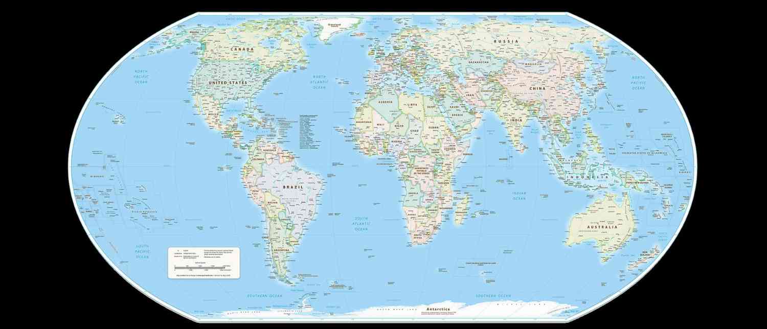
The world may soon start looking noticeably different in classrooms, textbooks and digital maps after the United Nations General Assembly backed a new approach to mapping the planet that gives a more accurate picture of the size of continents.
In a landmark vote on September 4, the UN General Assembly adopted a resolution encouraging governments, educational institutions, media organisations and digital platforms to consider moving away from the centuries-old Mercator projection in favour of equal-area map projections, including the newer Equal Earth projection. The resolution received 164 votes in favour, while the United States voted against it and six countries abstained.
The decision has reignited a surprisingly deep debate over something most people encounter every day without questioning it: the world map.
The change does not mean that the familiar Mercator map will suddenly disappear. The UN resolution is non-binding and does not prohibit its continued use, particularly in navigation, where the projection remains useful. Instead, it represents a push towards maps that portray the relative size of countries and continents more faithfully.
At the centre of the debate is Africa, a continent whose enormous geographical size has long been visually understated on the maps most people grew up seeing.
Why does Africa suddenly look much bigger?
The answer lies in the way a three-dimensional Earth is transferred onto a two-dimensional sheet.
The Earth is essentially a sphere, but a conventional flat map cannot reproduce a sphere without introducing some form of distortion. Different map projections make different compromises. Some preserve direction, others focus on shape, distance or area. No flat world map can perfectly preserve all four.
The Mercator projection, developed by Flemish cartographer Gerardus Mercator in 1569, was designed primarily for navigation. Its major advantage was that sailors could use straight lines on the map to maintain a constant compass direction while travelling across the oceans.
To achieve this, the Earth's surface was projected onto a cylinder and progressively stretched towards the poles. That made the map highly practical for maritime navigation but also caused landmasses farther from the equator to appear disproportionately large.
The result is a world map familiar to billions of people but one that can seriously distort perceptions of geographical size.
Africa, which straddles the equator, is particularly affected.
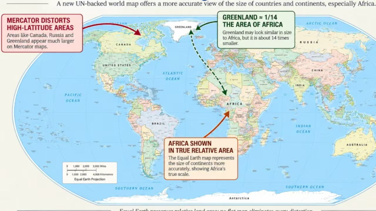
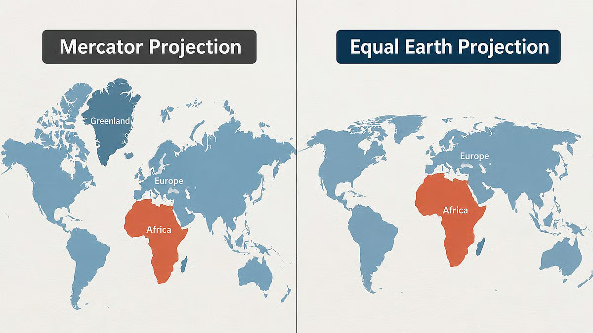
On a standard Mercator map, Greenland can appear almost comparable in size to Africa. In reality, the difference is enormous. Africa covers approximately 30.3 million square kilometres, while Greenland covers about 2.1 million square kilometres. Africa is therefore roughly 14 times larger.
The same distortion affects several other countries and regions.
Alaska, for instance, can look roughly comparable to Brazil on a Mercator map. In reality, Brazil covers around 8.5 million square kilometres, while Alaska is approximately 1.7 million square kilometres — meaning Brazil is nearly five times larger.
The effect becomes particularly dramatic as one moves towards the northern and southern extremes of the map. Canada, Russia, Europe, the United States and Greenland appear larger than their actual relative areas, while much of Africa and South America appears smaller.
India, too, is affected.
India is bigger than it looks on the familiar map
For generations, Indians have seen the country positioned on a world map in which its apparent size is reduced compared with countries farther north.
That is not because India's actual area changes, of course. It is a consequence of the projection being used.
Because India lies closer to the equator than many European and North American countries, its landmass does not receive the same visual enlargement that occurs at higher latitudes under the Mercator projection. As a result, India can appear smaller than its true relative size.
The Equal Earth projection attempts to address precisely this problem by preserving the relative areas of landmasses more accurately.
But India's support for the UN resolution came with an important clarification.
New Delhi backed the broader principle of using equal-area projections but stressed that the resolution should not be interpreted as endorsing one particular map or determining political boundaries. India also made clear that any international map must depict Jammu and Kashmir and Ladakh in accordance with India's official map.
The distinction is significant because a map does more than illustrate geography. It can also represent political boundaries, sovereignty and territorial claims.
India therefore supported the cartographic objective while maintaining that the question of national boundaries is separate from the technical issue of map projection.
What is the Equal Earth projection?
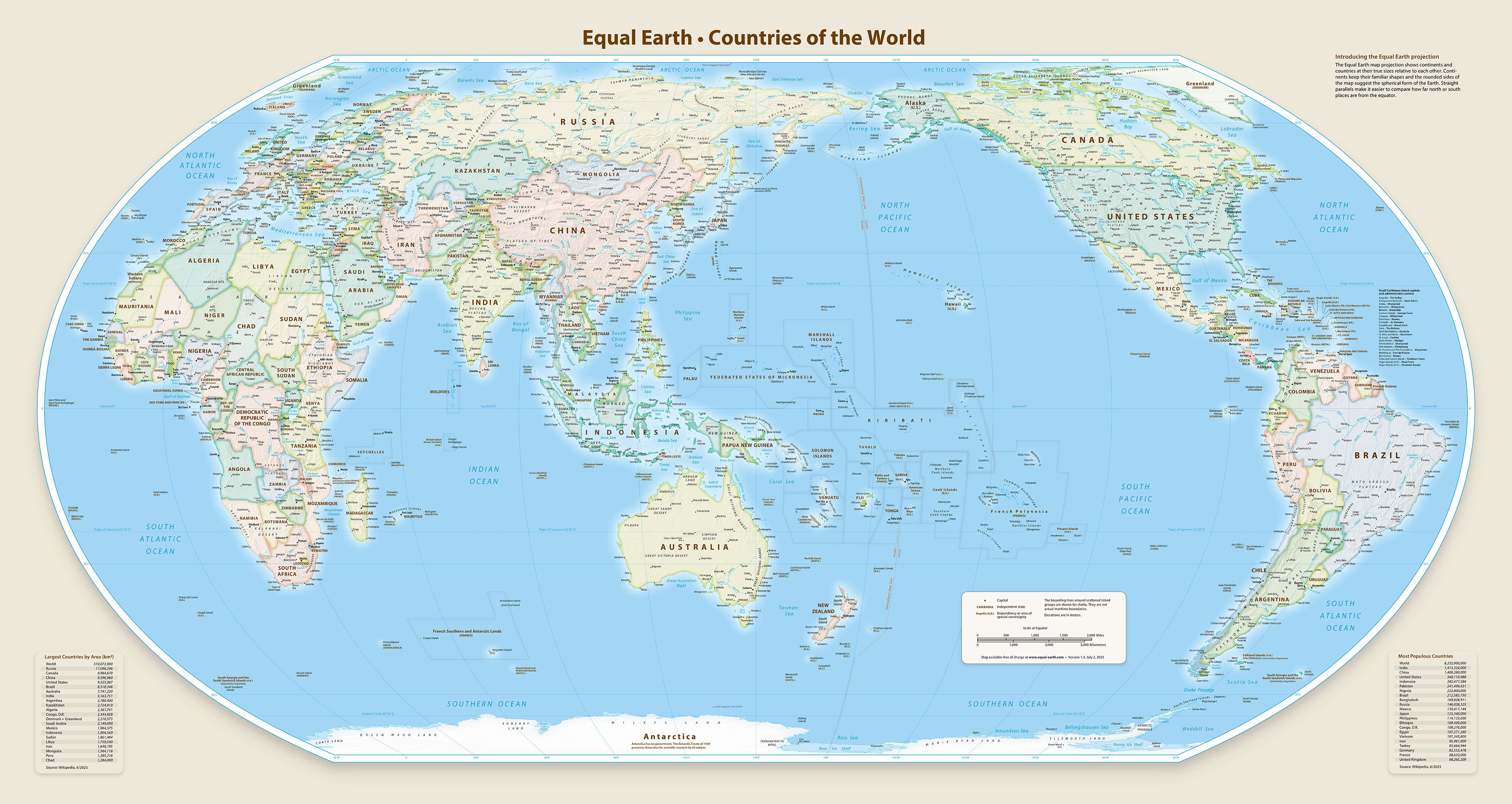
The Equal Earth projection was developed in 2018 by cartographers Bojan Šavrič, Bernhard Jenny and Tom Patterson.
Unlike the Mercator projection, Equal Earth is an equal-area projection. Its central objective is to ensure that the relative sizes of landmasses remain much closer to their actual proportions. It was designed to provide a visually balanced world map without producing the extreme shape distortions associated with some earlier equal-area projections.
When the two maps are compared, some striking changes become obvious.
Africa expands dramatically.
Europe appears smaller.
Greenland shrinks.
Brazil becomes much more imposing.
South America occupies a far greater visual presence.
The United States, Canada and Russia also lose some of the exaggerated scale associated with their position at higher latitudes.
The change is especially striking when countries are compared directly rather than viewed individually.
This is why interactive comparisons of the Mercator and Equal Earth projections can be so surprising: places people instinctively assume are similarly sized can turn out to be dramatically different in reality.
Does this mean the Mercator map was "wrong"?
Not exactly.
The Mercator projection was created for a specific purpose, and for navigation it remains extremely useful.
Its problem arises when it is treated as though it were an accurate representation of the relative size of the world's landmasses.
A world map has to make choices. Preserving one geographical characteristic inevitably affects another. A projection that maintains accurate direction may sacrifice area. One that preserves area may distort shape or distance.
Several alternatives have emerged over the decades.
The Gall-Peters projection, for example, preserves area but significantly stretches and compresses the shapes of countries. The Robinson projection attempts to balance different types of distortion, while the Winkel Tripel projection seeks a compromise between area, shape and distance.
Equal Earth belongs to the same broader effort to find a more balanced way of representing the planet on a flat surface.
In other words, the debate is not really about finding a map with zero distortion. Such a map is impossible on a flat surface.
It is about deciding which distortions are acceptable for a particular purpose.
Why has the issue become political?
The latest campaign has gone beyond cartography.
African governments and advocacy groups have argued that maps can influence how people perceive the importance and scale of different parts of the world. The long-standing visual dominance of Europe and North America, combined with the shrinking of Africa, has therefore been criticised as part of a wider historical and cultural imbalance.
The campaign behind the UN resolution has sought to challenge that perception and promote what supporters describe as a more equitable visual representation of the world.
The initiative was led by Togo and supported by the African Union, with the argument that changing maps can also help challenge colonial-era legacies in education and public perception. Togo has said it intends to introduce the Equal Earth projection into its school geography materials by the end of 2026 and encourage other governments, educational institutions and technology companies to follow.
The argument is straightforward: if maps shape how children understand the planet, then the way countries and continents are visually represented matters.
The United States, however, opposed the UN resolution, describing it as ideological and arguing that the organisation should focus on more pressing global issues. The vote nevertheless passed overwhelmingly, with only the US voting against it.
Will Google Maps and other digital maps change?
Not immediately.
The UN resolution does not force governments, companies or technology platforms to abandon Mercator. It encourages them to consider equal-area alternatives.
Some major institutions have already been moving in that direction. Static maps used by international organisations can employ projections such as Equal Earth or Winkel Tripel, while digital mapping platforms have increasingly adopted three-dimensional globe views to reduce some of the distortions inherent in flat maps.
Navigation is another matter.
The Mercator projection remains particularly valuable for maritime and aerial navigation because of the way it represents direction. The new UN-backed approach is therefore not a simple instruction to replace every Mercator map everywhere.
Instead, the future is likely to involve different projections for different purposes.
A new map, but an old lesson
The significance of the UN decision goes beyond whether Africa looks bigger or Europe looks smaller.
It is a reminder that maps are not neutral windows onto the planet. They are mathematical representations created for particular purposes, and every projection involves choices.
For centuries, the Mercator map became so familiar that its distortions largely disappeared from public consciousness. Children learned geography from it, textbooks reproduced it and wall maps made it the default image of the world.
The Equal Earth projection now offers a different perspective — one in which Africa's enormous scale is immediately visible and countries closer to the equator are no longer visually diminished.
The planet itself has not changed.
Africa has not suddenly become larger. Europe has not physically shrunk. India has not gained territory.
What has changed is the way the world is being represented.
And that may ultimately be the most important part of the debate: sometimes correcting a map can also force people to reconsider the mental picture of the world they have carried for generations.
With input from agencies
Image Source: Multiple agencies
© Copyright 2026. All Rights Reserved. Powered by Vygr Media.