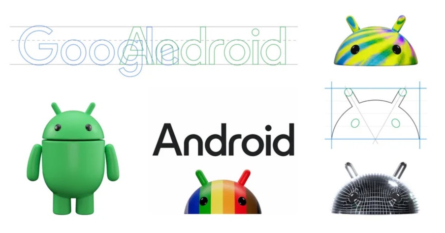
Google has revealed a refreshed look for the Android logo and branding, while users were in anticipation of the Android 14 release. This redesign is the first since 2019 and aims to create a more modern and integrated connection between Android and Google. The most noticeable change is the use of an uppercase 'A' at the beginning of the Android text logo, aligning it better with the Google logo.
The new Android logo with the robot face features a striking three-dimensional appearance, enhancing its visual appeal and adaptability to various colours. This design evolution signifies Google's commitment to providing users with more choice and autonomy, in accordance with Android's open platform philosophy.
Source: Google
The iconic Android robot, known as the Bugdroid, has also undergone a transformation, gaining a dynamic three-dimensional look and more character. Google's intention is to make the bugdroid as dynamic as Android itself, and various bugdroid variants, including a disco ball and melting jelly, have been introduced.
Google announced a number of new features and improvements in addition to the branding changes. Android Auto now supports Webex and Zoom, allowing users to join conference calls and manage meeting schedules directly from their vehicles. The "At a Glance" widget, which was previously only available on Google Pixel devices, is now available on all Android smartphones, allowing quick access to calendar entries, weather, and notifications. Also, Google Wallet now allows photo imports of passes with barcodes or QR codes.
Overall, these changes not only modernize the Android brand but also enhance the functionality of Android devices, offering users more convenience and choice in their daily interactions with Google's ecosystem.
Ⓒ Copyright 2023. All Rights Reserved Powered by Vygr Media.
