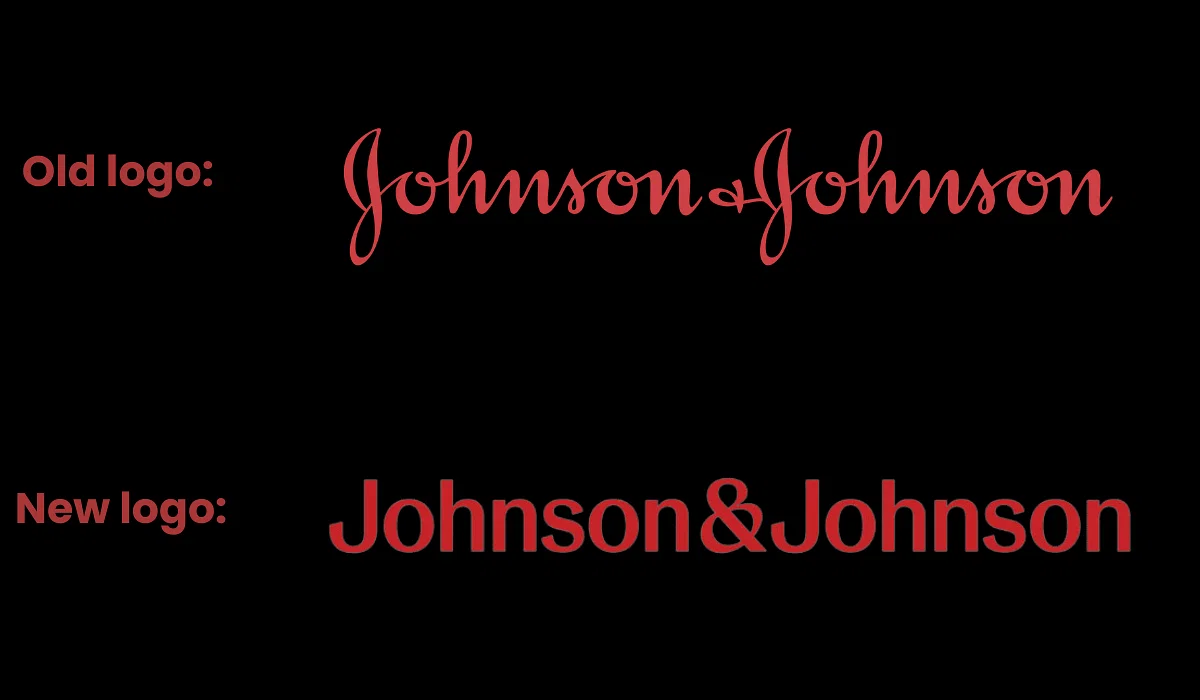
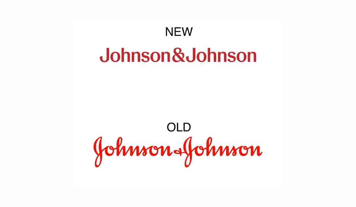
After 136 years of sporting its iconic cursive logo, Johnson & Johnson is bidding farewell to tradition. The healthcare behemoth announced its plans to unveil a contemporary logo, signalling its heightened focus on pharmaceuticals and medical devices.
A New Look for a New Era
The familiar cursive signature of co-founder James Wood Johnson is being replaced by a straightforward font in a distinct shade of red. This transformation is a testament to the company's evolution into a "pure play healthcare company," emphasizing its commitment to innovation and care.

In an official statement, the pharmaceutical giant stated, "The new Johnson & Johnson brand identity builds upon the company's legacy while modernizing key elements to showcase healthcare innovation in a manner that is inclusive and resonates with our warm, caring ethos."
The revamped logo features a new ampersand, which symbolizes the company's caring and humanistic approach. It aims to become a globally recognizable emblem, reflecting the openness of the brand and its dedication to fostering meaningful connections that bring its purpose to life.
Mixed Reactions from Netizens
The announcement stirred varied reactions among netizens. While some questioned the need for change after such a successful run, others appreciated the modern touch. One netizen commented, "If something has worked for 136 years, why mess with success?" Meanwhile, another remarked, "The new logo might take some time getting used to, but it sure looks modern."

However, not everyone welcomed the change warmly. A dissenting opinion noted, "This will not boost sales but rather cause confusion. This move lacks consumer input. The original signature spoke to a sense of pride in ownership. This new direction makes me wonder about their commitment to the next generation."
A Gradual Transition
For now, consumers might not immediately notice the change, as the cursive logo will continue to adorn products like Band-Aid and Tylenol. Johnson & Johnson recently split into two companies, with one focusing on medical devices and medications and the other on consumer health products under the brand name 'Kenvue.' A spokesperson from Kenvue indicated that the J&J branding on products such as Band-Aids would be phased out over time.

The signature logo was most prominently associated with the company's talcum-based baby powder, which is no longer in production and faced numerous lawsuits alleging a link to cancer a claim the company vehemently denies.
© Copyright 2023. All Rights Reserved Powered by Vygr Media.


